Heatmap
Heatmap is the most visual element of Qosium Storage, raising performance monitoring of wireless networks to a new level. While the heatmap is at its best when dealing with wireless networks, it can also serve fixed network monitoring since Qosium Probes can be given a fixed location.
Contents
1. General #
To use Storage’s heatmap functionality, you need Internet access because the map is downloaded online dynamically.
The metric visualized is Qosium’s QoE, i.e., GQoSM or PSQA. Main coloring is logical:
- No color: no results
- Green: Good performance
- Yellow: Average performance
- Red: Bad performance
In practice, there are countless shades between the main colors to indicate how bad or good the performance is.
2. Control #
Controlling the map is easy and similar to the heatmap of Qosium Scope:
- Zoom in/out:
- Keyboard: +/-
- Mouse: wheel
- Move:
- Keyboard: the arrow keys
- Mouse: left button + moving
- Rotate / tilt
- Keyboard: shift + the arrow keys
- Mouse: right button + moving
- Selection zoom
- Mouse+keyboard: shift + left button + moving
3. Sections #
The Heatmap tab is divided into three sections:
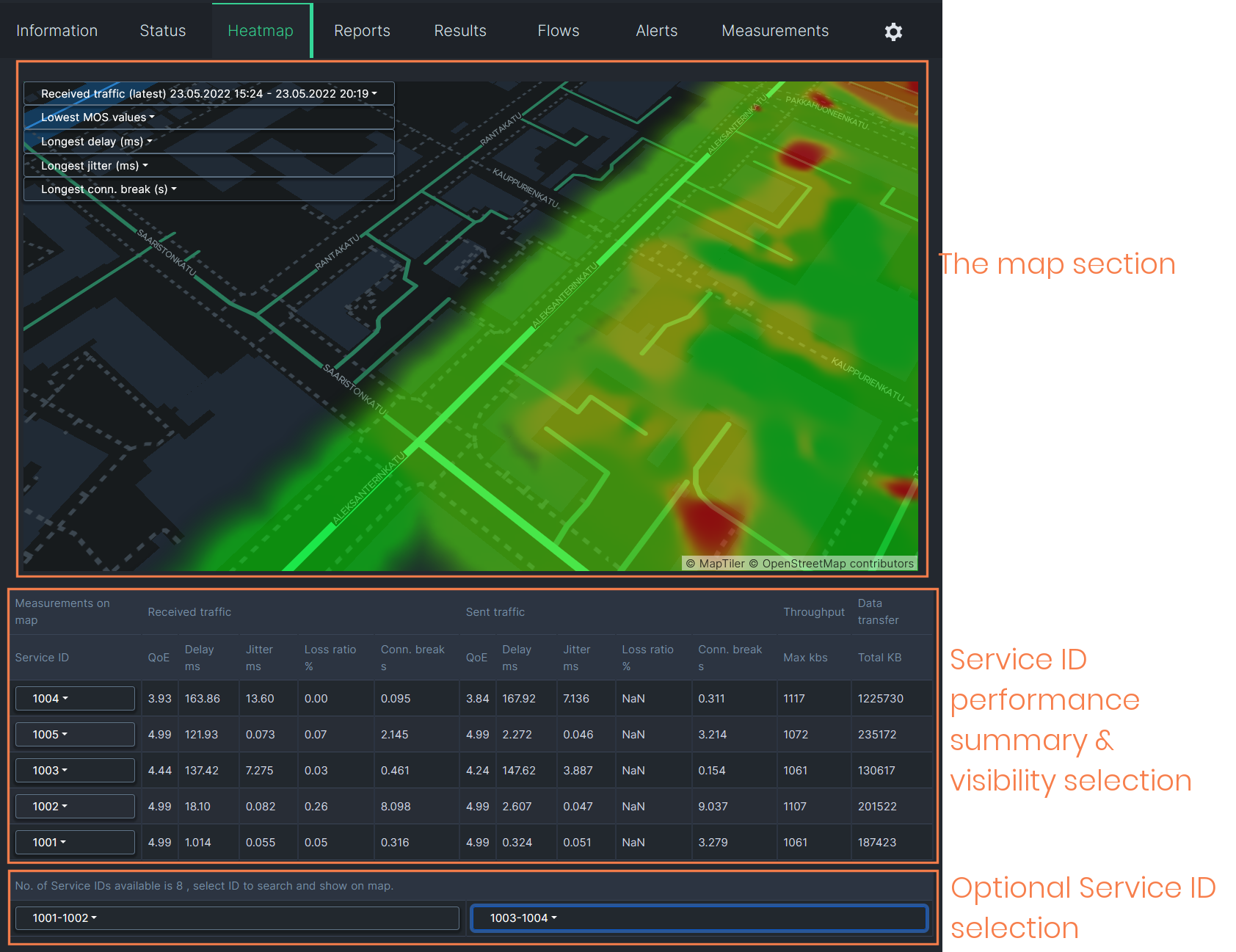
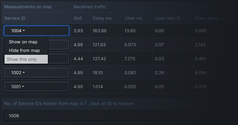
Qosium Storage’s heatmap is currently tightly bound to Qosium Probes’ Service ID. That is because Service ID is often used to distinguish devices in the field, making it a device ID. Thus, Service ID is the natural identifier according to which you can select results in the map. In addition to selection possibilities, the middle section in the Heatmap tab shows QoS summaries per Service ID.
4. Select What to Show #
4.1. General #
There are many ways to select what to show on the map. The two main dimensions according to which you can select results are currently:
- Time and
- Service ID.
In addition, you can select that does the visualized quality consider sent or received traffic.
The typical workflow is to select the interesting time window and then filter the Service ID’s you wish to observe.
4.2. Time Selection #
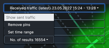
The time window from which to show results on the map can be a real-time window or your selection in the past. The currently visible time window is shown in the top row of the control panel, located in the upper left corner of the map:
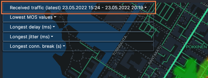
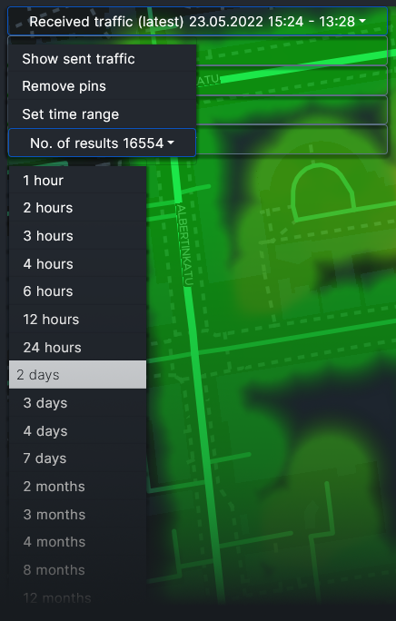
When the text ”latest” is visible, it means that the view is in real-time mode:
To set the time window in the real-time mode, click the top row of the control panel first. A smaller menu opens up. There, click the lowest item, Number of results. Now you see that a list opens where you can pick the size of the real-time window., e.g., two days:
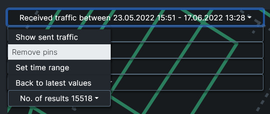
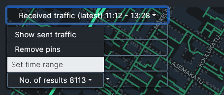
To show a specific time range in the history, click the top row: the menu pops up again. Then select Set time range:
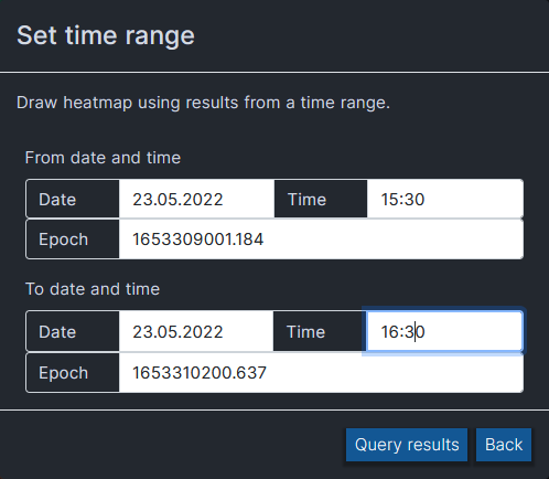
A separate box opens, letting you set the time range. Set the desired lower bound (From) date and time and then the desired upper bound (To) date and time. When done, press Query results.
After fetching the results, a new heatmap is drawn with the newly selected time range.
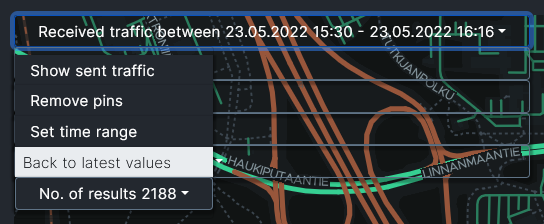
 After setting the time range like this, the map no longer updates in real-time.If the selected time range contains results only in a certain shorter interval, then that interval will be shown instead of the set time range.
If you want to get back to the real-time view, click the menu open again and select the new option: Back to latest values.
4.3. Direction #
The control panel’s top row tells the current direction of the visualized traffic. To change it, click the top row: the already familiar menu pops up. Then select the other direction, e.g., sent traffic:
4.4. Service ID selection #
By default, the heatmap shows all the results in the selected time interval. Results can, however, be filtered in and out according to Service ID. That is done in the Measurements on map table below the heatmap. The rows show key statistics averaged over the Service IDs shown in the first column. Click the desired Service ID to get a pop-up list of three items:
- Show on map: Adds a pin pointing the last location of the set on the heatmap.
- Hide from map:
- Hides the results set from the heatmap.
- The results set of this Service ID is transferred below in the list of hidden Service IDs.
- By clicking the Service ID in the list below, you get the results back on the map.
- Show this only:
- Hides all the other results and shows only results with this Service ID.
- To restore all the results, click the Service ID and select Show all.
5. Pinpointing Values #
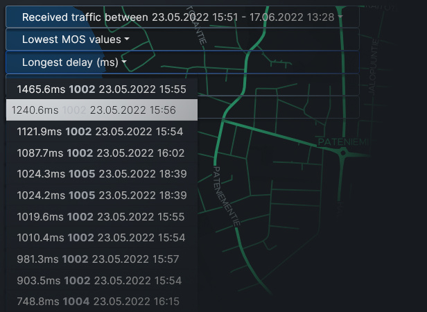
There is a nice feature in the heatmap that allows you to pinpoint interesting events. Just below the time range in the control panel, you can open drop-down selections of extreme values of different statistics. For example, in the Longest delay (ms) selection, you can see the longest individual delay values among the results currently shown. By selecting one of the values, you get a pin on the map revealing the location of this occurrence.
There can be multiple pins on the map at the same time. By clicking a pin, you get information about that particular measurement result.
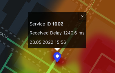
To remove the pins on the map, open the drop-down menu of the control panel and select Remove pins.