
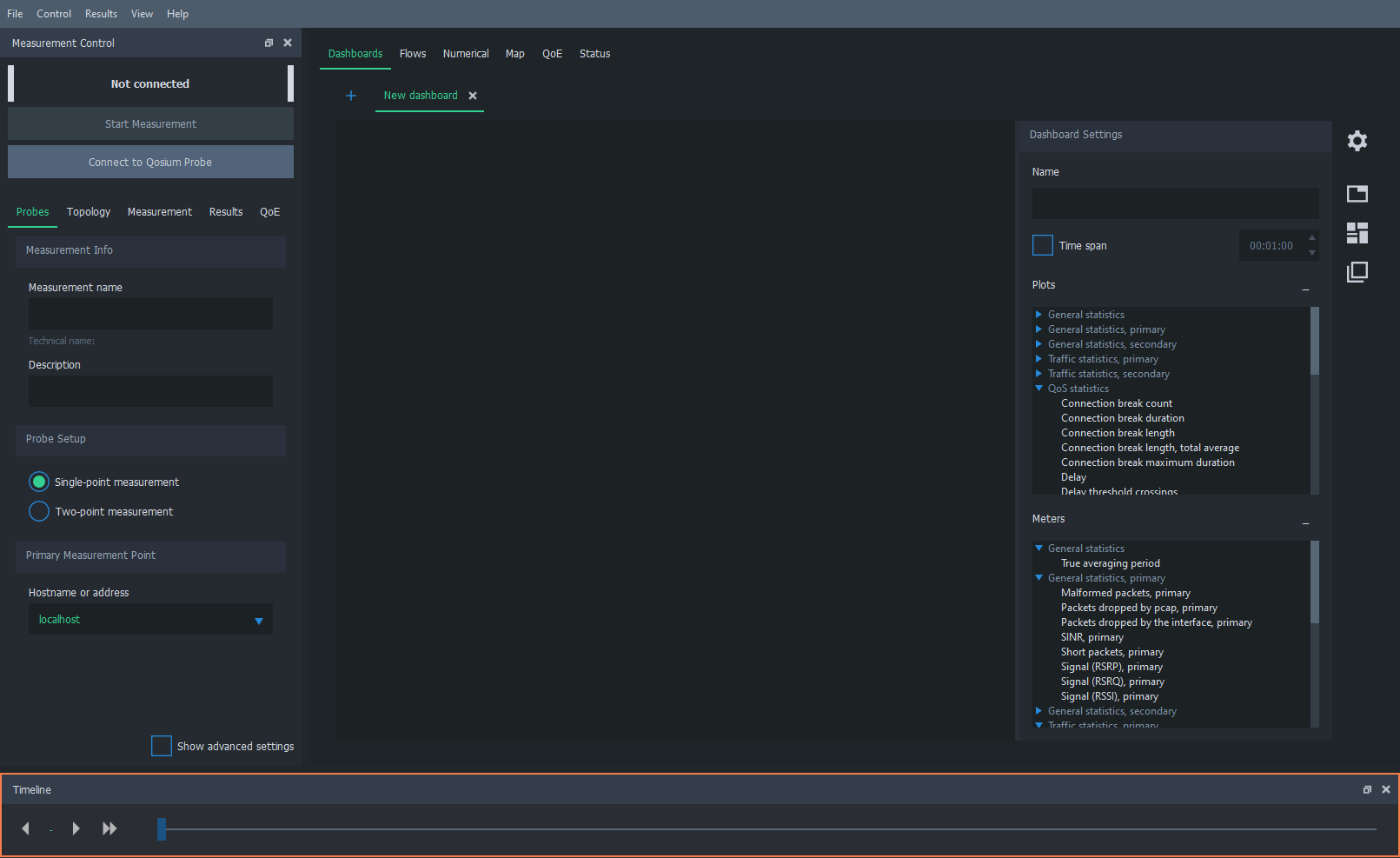
Timeline
Timeline is a useful feature in Qosium Scope to align interesting observations in the results between different statistics and views.
1. Overview #
Timeline is, by default, located at the bottom of the Scope main window. As with all the other floating elements, it can be relocated and its visibility is controllable in the Menu bar. Timeline has two elements:
- Time display
- Time selection bar
2. Time Display #
The time display shows the exact time where the timeline marker is currently set. The element is dynamic, also having buttons for adjusting timeline steps:
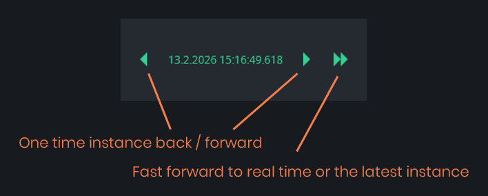
The fast-forward button takes you back to real-time or just to the latest value if the measurement is not running. Once in real-time, the button gets gray:
3. Time Selection Bar #
The time selection bar also works in two directions. As seen below, the bar shows that the timeline marker is now located around the middle of the measurement. To set the marker to the desired place, grab the timeline indicator (the blue rectangle) with your mouse and drag it where desired. Once you have selected the timeline indicator, you can also use the arrow keys right and left to move the timeline in single result steps.

The left-hand end of the bar shows the start time of the measurement. The right-hand end of the bar shows the end time of the measurement. If the measurement is still running, it always shows the latest time results have been received.
4. Tracing an Interesting Event #
The main purpose of the timeline is to trace interesting events in the results and align the findings across different views.
Let’s take an example. We have a set of field measurement results of a 5G test network for a video stream from a camera on board a measurement vehicle. There were some QoS problems observed, so let’s take a closer look at them. As seen below, there are very high occasional delay spikes and increased jitter observed.
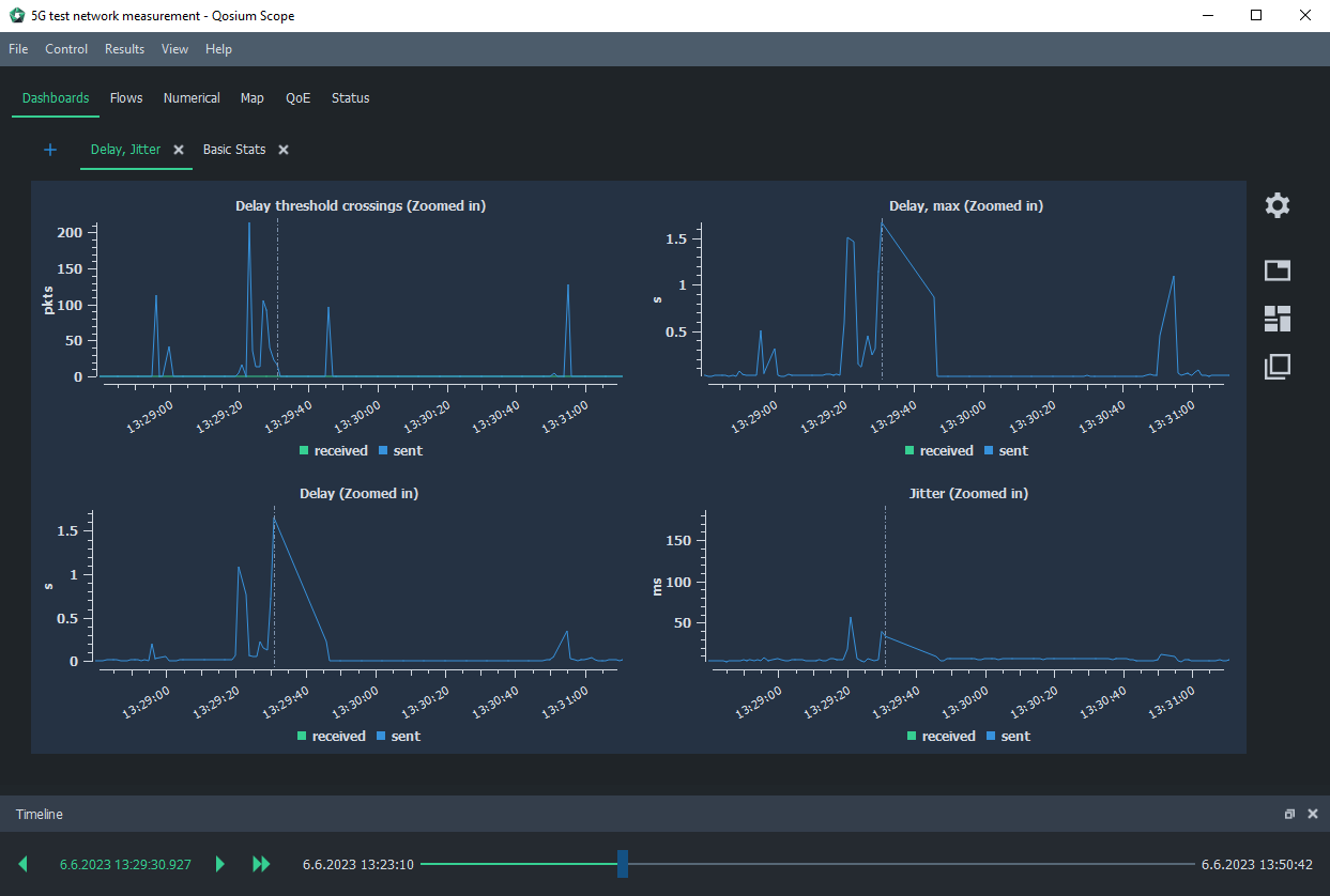
We first zoom in on the delay figure using the mouse scroll wheel. The most interesting spike is the one over 1.5 s, so let’s set the timeline marker there by clicking the right mouse button and selecting: Set Timeline Point.
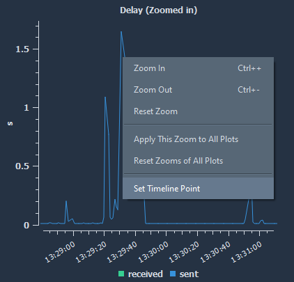
Then, we also take other graphs visible and set the same zoom level for all of them by clicking again the right mouse button on top of the zoomed graph and selecting: Apply This Zoom to All Plots. As seen now, the zoom level is the same in all the graphs, and the timeline marker pinpoints the interesting spot in all of them, enabling easy comparison.

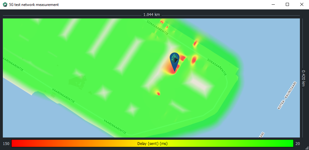
Timeline applies across different views. Thus, let’s go next to the heatmap and visualize, e.g., the delay there. As seen in the figure below, an icon pinpoints Qosium Probe’s location at the timeline marker. You can try to move the timeline marker and see that Probe on the map moves accordingly. This is a handy way to see where the interesting event occurred.
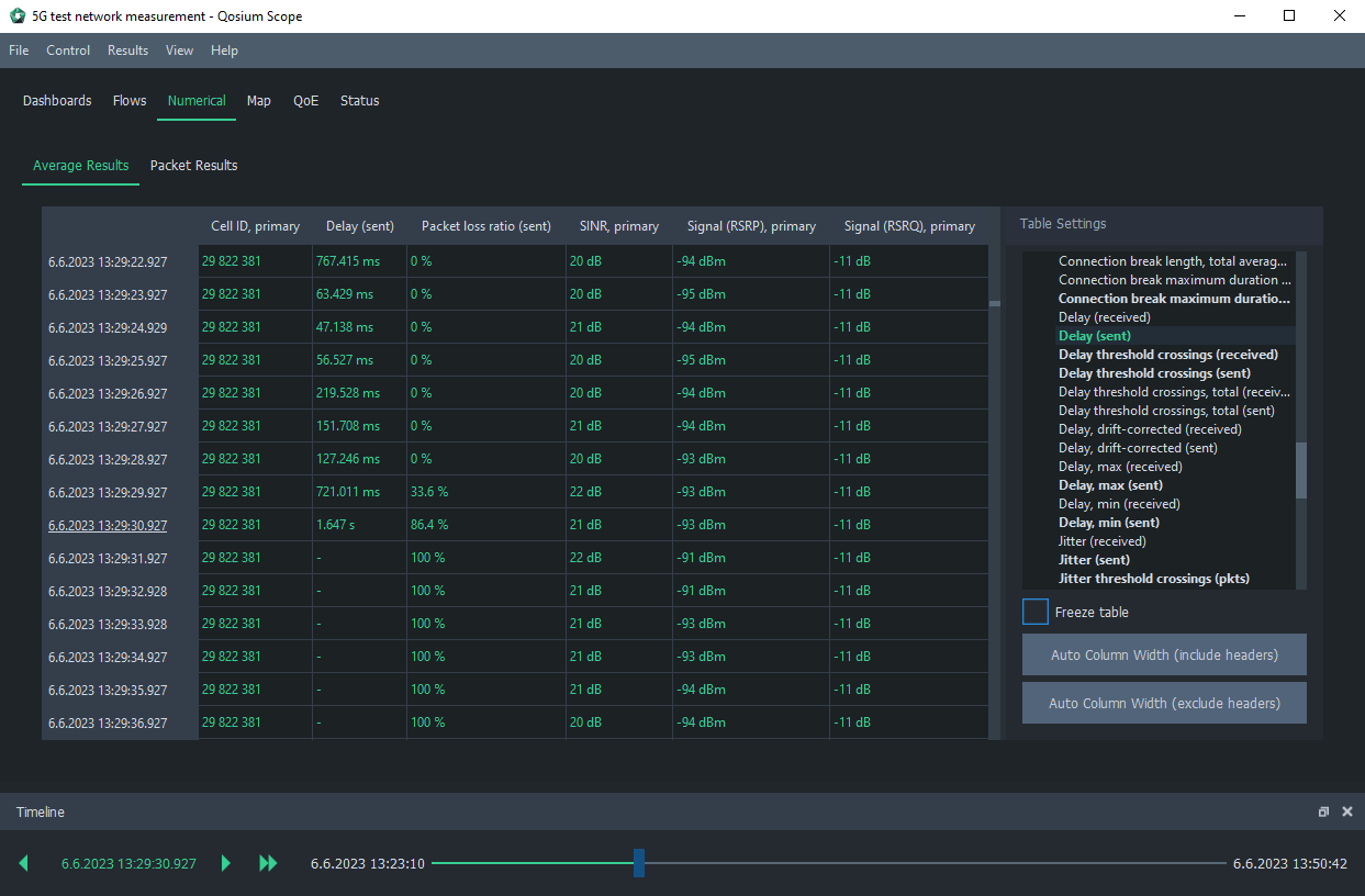
Finally, in this example, we examine the numerical view. As shown below, the numerical view has also stabilized (as indicated by the underlined timestamp) according to the timeline marker. The view reveals that when the delay spikes to over 1 second, a connection break also begins, delay values are no longer recorded, and the packet loss ratio jumps to 100%.
By checking the Cell ID, we see that it remains unchanged, meaning the connection break is not caused by a handover. Additionally, the signal values are not poor enough to explain the degraded QoS. Thus, simple coverage issues can be ruled out, and the root cause of the poor QoS must be investigated further.
This was an example of how to use the Timeline feature of Qosium Scope. It is very useful when you need to trace interesting events. Timeline allows aligning the different views of Qosium Scope to see where the interesting event was and what values the other statistics showed at that time.