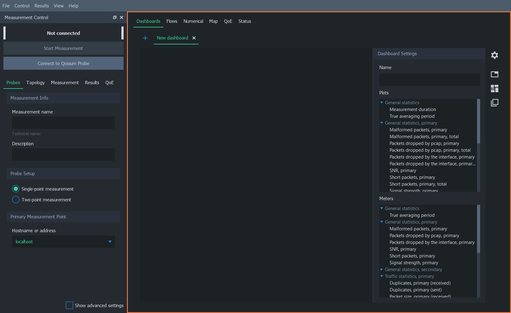
Workspace Area
The workspace area in Scope hosts the result visualization views. In this area, measurement results can be configured, viewed, and analyzed.
The workspace area is on the right side of the window:

The workspace area is divided into six main tabs, which offer various methods to view and analyze measurement results. See the subsections below for more information on each tab.
Visualizing average results in charts is the most common way to analyze measurement results in Qosium Scope. This can be done in the dashboards tab.
The Flows tab of Scope contains Flow Analyzer, allowing you to examine the details of what kind of traffic flows the total traffic is composed of.
The numerical tab in Scope has two sub-tabs: Average results and Packet results. As the names imply, these two tabs show the corresponding result types in numerical table format.
The map tab in the Scope workspace area is used to draw heatmaps on a geographical map. This type of visualization is beneficial when measuring Quality of Service or Quality of Experience in a real location.
The QoE tab can be used to configure and show a Quality of Experience indicator window. This window visualizes QoE statistics from average results and can be placed, for example, next to an external application window for quality reference.
The status tab displays information about the current measurement and the operation of Scope.

